From Hibernating Brand…
To 4th Most Recognised Beer Brand In The UK, Worth $30 Million

Twenty years after the brand was discontinued, this much loved brand was relaunched by two friends. Hofmeister is a different animal now though, only brewed in the heart of Bavaria, made according to the Reinheitsgebot German beer purity law, and uses only three ingredients: mineral water, locally grown barley, and Hallertau Hops.
THE BRIEF: Hofmeister used to be brewed in the UK, at only 3.5%, and after initially being much loved, eventually fell out of favour… We want to relaunch with a seriously great beer brewed in Bavaria, and reinvigorate the brand visually. There is a lot of latent love for Hofmeister and its mascot ‘George the Bear’, so we want to capture that recognition if possible.
THE OPPORTUNITY: Retain any distinctive brand visual assets, imbue the design with Germanic craft, but make it contemporary and relevant to new drinkers. Hofmeister and George the Bear always had twinkle in their eye, and we wanted to retain that.

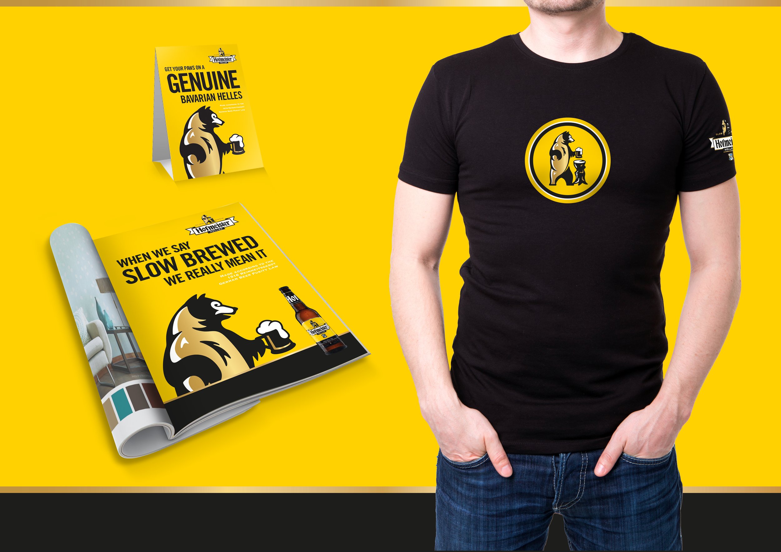
Distinctive Brand Assets Developed

THE ICONIC BEAR: Our brand new contemporary bear - now unchained, and only dancing to his own tune.

THE WORD MARQUE: Typography drawn from Hofmeister’s rich visual history. Germanic and characterful, just like the beer.

COLOUR BALANCE: Of course we leveraged the distinctive yellow, added more punch with the black, and introduced a premium gold.

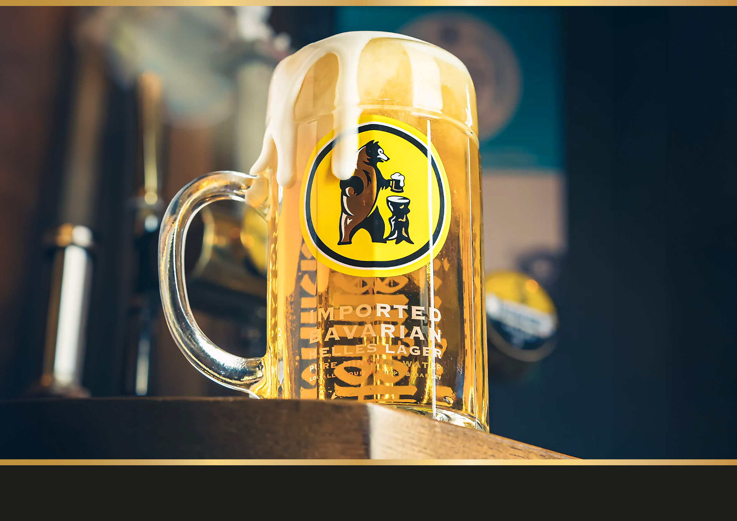
PROVENANCE: Proudly born and brewed in Bavaria, the crest reflects a rich heritage and tradition of brewing over centuries.

QUALITY REASSURANCE: Genuine ingredients, genuine quality. It was important to denote the dramatic quality shift in the beer.

BAR CALL: ‘Make mine a Hof, please’. The neck label establishes a straight-forward bar call in the consumer’s at-bar vocabulary.
Our New Hofmeister

THE HOFMEISTER FAMILY: As the brands success grew from strength to strength, two new clearly differentiated variants were added - Weisse, and Ultra Low.

BRAND MARQUE: A brand new bear - now unchained! Typography developed from Hofmeister’s visual history, and a celebration of their Bavarian provenance.

PACKAGING: A celebration of the instantly recognisable brand colours, giving us on-shelf pop and rapid ‘findability’ at the fixture.

TAP HANDLES AND FONTS: Elegant and modern with a nod to tradition. The use of ‘Hof’ as a shorthand for the brand, gives us a great bar call.

BAR FURNITURE: Elevates the bear as our primary recognisable brand asset, wth a cheeky tone of voice through the brands copywriting.

‘FOLLOW THE BEAR’: An original advertising strapline for the brand back in the day, now takes on added meaning in the age of social media.