

Spice Alchemy
What We did:
Creative Strategy
Brand Creation
Brand Design
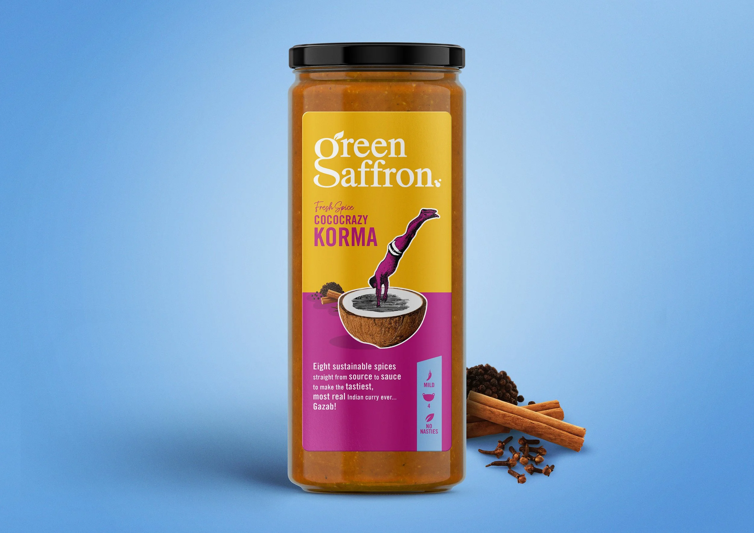
Packaging Design
Brand World
Green Saffron, led by their Anglo-Indian food entrepreneur and chef founder Arun Kapil, are an award-winning independent brand that produce stunning spice blends, sauces, rice, and chutneys made with spices sourced by their family members in India, which uniquely travel from ‘source to sauce’ in just 8 weeks.
THE BRIEF: “Help us communicate our blending expertise in a fun and quirky manner that reflects our personality, and help the consumer feel confident about how easy it is to cook with our delicious spice blends”
THE OPPORTUNITY: Green Saffron are rightfully famous for their quirky and unexpected spice blends, and everything about this redesign reflects both their maverick ethos, and the vibrant personality of Arun himself… we named it ‘Spice Alchemy’, and that thought runs through the whole design.
THE RESULTS: Green Saffron has gone from strength to strength during partnership with Simon Pendry Creative, and is now stocked in Waitrose UK, Tesco Ireland, 150 SuperValu’s and over 100 deli’s, farm shops and independent food stores across Ireland and the UK.

THE BRAND MARQUE: We blended the ‘g’ and the ‘s’ of Green Saffron to give us uniqueness, and of course reflect the brand’s spice blending skills. The subtle ‘herb and spice’ detailing also add craft.

ILLUSTRATIONS: A collage style blending Victorian illustrations together with ingredient photography creates an unexpected visual language for the brand that brings a smile to the mind.


COLOURS: vibrant and unexpected colour combinations have been used to convey both the taste of the blends, and provenance of the spices.

TONE OF VOICE: A fun brand language has been developed to elevate the uniqueness of the Green Saffron blends… this isn’t just korma, it’s Cococrazy Korma! (Gazab! translates to ‘delicious’ btw!)

HELP ME COOK!: A clear system of ‘spice temperature’, ‘number of servings’ etc has been developed on front of pack for ultimate clarity, and a simple three step recipe is supplied on the back of pack.

ON-SHELF STANDOUT AND DIFFERENTIATION: The whole range together creates a striking blocking effect on shelf, and really pops!


THE FAMILY: The range also consists of delicious sauces and Basmati rice, that maintain a holistic look and feel.


BRAND WORLD: Leveraging the brand assets to consistently create an engaging and creative look & feel at every touchpoint, encouraging brand love.


